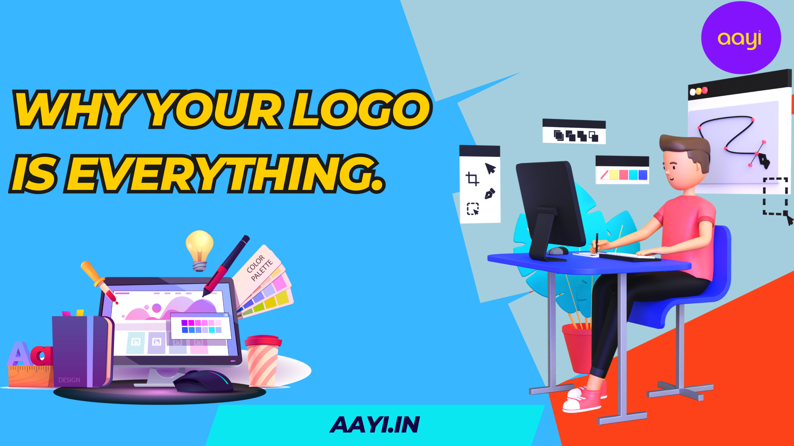
Imagine walking down a busy street. You see a golden “M” or a simple “Swoosh.” You don’t need to read a sign to know what they sell or how they make you feel. That is the power of a logo. As Aayi always says: “You don’t need to shout to be noticed if you’re wearing the right face.”
Your logo is the “silent ambassador” of your business. Here is why it’s your most important investment.
1. It’s Your First Impression
In a world of endless scrolling, you have three seconds to grab attention. A professional logo tells customers
2. It Builds Loyalty
Consistency creates memory. The more a customer sees your logo, the more they trust you. Eventually, that symbol represents the great service you provide. When they see it again, they don’t think—they just buy.
3. It Sets You Apart
Don’t be a “copy-paste” business. Your logo shows how you are different. Are you a corporate giant or a cozy, eco-friendly nook? Your logo tells that story instantly.
4. It’s Your Brand’s Anchor
To look professional, you must look the same everywhere. Your logo dictates your website colors, your ad layouts, and the “vibe” of your office. Aayi reminds us: “If the foundation is strong, the house stands tall.”
The 3 “S” Rules of a Great Logo
| Feature | What it Means |
| Simple | Easy to recognize at a glance. |
| Scalable | Looks good on a huge billboard or a tiny phone screen. |
| Sustainable | Avoids trends so it still looks good in 10 years. |
The 7 Types of Logos
1. Wordmark (Logotype)
This logo is purely text-based, focusing on the company’s name in a custom or distinct font.
- Best for: Businesses with short, catchy, or unique names.
- Examples: Google, Coca-Cola, NASA, Visa.
- Why it works: It builds strong name recognition immediately.
2. Lettermark (Monogram)
These consist of initials or a brand’s acronym. They turn a long name into a sleek, manageable visual.
- Best for: Companies with long or difficult-to-pronounce names.
- Examples: HBO (Home Box Office), IBM, HP, CNN.
- Why it works: It’s minimalist and easier to fit on small surfaces like social media icons.
3. Pictorial Mark (Logo Symbol)
This is an icon or graphic-based logo. It’s a literal image that represents the brand.
- Best for: Established brands or businesses where the image perfectly matches the name.
- Examples: Apple (the apple), Twitter/X (the bird), Target (the bullseye).
- Why it works: It’s instantly recognizable without needing to read a single word.
4. Abstract Logo Mark
Unlike pictorial marks, these don’t represent a real-world object. They use geometric shapes to create a unique feeling.
- Best for: Global brands that want to convey a “vibe” (like movement or unity) rather than a specific product.
- Examples: Nike (Swoosh), Pepsi (Circle), Adidas (Three Stripes).
- Why it works: You can assign your own meaning to the shape over time.
5. Mascot Logo
These involve an illustrated character that acts as the “ambassador” for your brand.
- Best for: Service brands, sports teams, or companies targeting families and children.
- Examples: KFC (Colonel Sanders), Pringles, Wendy’s.
- Why it works: It makes the brand feel friendly, approachable, and human.
6. Combination Mark
A mix of a wordmark and a symbol (pictorial, abstract, or mascot). This is the most popular type of logo.
- Best for: New businesses that want the benefit of both an icon and their name.
- Examples: Burger King, Lacoste, Doritos.
- Why it works: It’s versatile. You can use the text and icon together or separately as your brand grows.
7. The Emblem
Text is inside a symbol or an icon; think badges, seals, and crests.
- Best for: Schools, government agencies, and the auto industry.
- Examples: Starbucks, Harley-Davidson, Harvard.
- Why it works: it conveys a sense of tradition, prestige, and authority.
Your logo is the heart of your brand. It invites customers in and stays in their minds. Without a strong logo, your business is just another face in the crowd. “Don’t build a house on sand. here Aayi fix your identity first, and the business will take care of itself.”
“Designing logos for the digital future.”